Quick answer
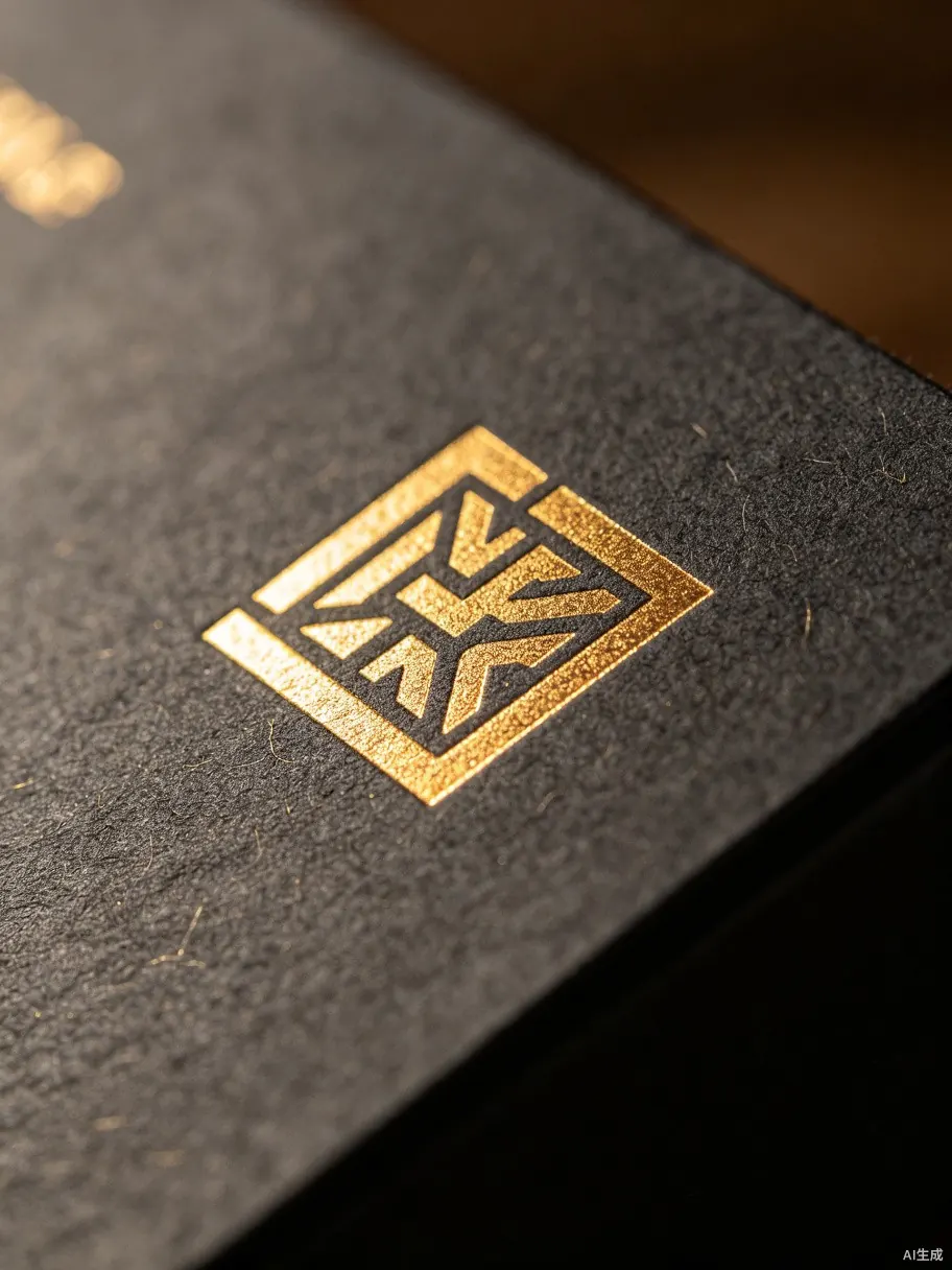
Foil stamping adds metallic or pigmented film through heat and pressure. Embossing raises part of the surface. Debossing presses it inward. Spot UV adds a glossy layer to selected areas. Each effect can improve tactile value, but each also depends on artwork size, line thickness, substrate, tooling and registration.
Before choosing a finish, decide what it should do: highlight a logo, create a tactile pattern, contrast matte and gloss, or signal a gift-level SKU. For material options, review Materials & Finishes.
How the main finishes behave
| Finish | Effect | Watch point |
|---|---|---|
| Foil stamping | Metallic, matte or pigment foil applied to selected artwork. | Small text, thin lines and textured paper can reduce sharpness. |
| Embossing | Raised surface that creates tactile depth. | Needs enough area and board strength to show clearly. |
| Debossing | Pressed-in surface for subtle luxury feel. | Can look weak on thin board or busy artwork. |
| Spot UV | Gloss contrast on matte printed areas. | Registration and scuffing must be checked in proofing. |
What changes cost
The cost impact usually comes from setup and control, not only material. A separate die or plate may be needed. The finish area, number of positions, number of foil colors, registration tolerance and production speed all matter. Applying foil to a small centered logo is simpler than applying multiple foil areas across folds and edges.
Surface choice also matters. Smooth coated paper can hold crisp foil differently from textured paper. Dark paper may make metallic foil stand out, while uncoated paper can create a softer result. A finish that looks beautiful on one reference may not behave the same on another board or wrap material.
Artwork checks before tooling
Premium finishes need clean artwork separation. The production team should know which layer is print, which layer is foil, which layer is emboss or deboss, and which layer is spot UV. Vector files are usually safer than flattened artwork. Avoid tiny reversed text, extremely thin foil lines, and finish areas that cross critical fold lines without review.
Color expectations should also be clear. "Gold foil" is not one universal shade. Champagne gold, yellow gold, antique gold and matte gold can read very differently against the same paper. If brand color control matters, request a material or foil reference before mass production.
Proofing checklist
- Confirm the finish layer in the dieline or artwork file.
- Check whether the finish crosses folds, seams or tight corners.
- Review small logo details and line thickness before tooling.
- Ask whether the chosen paper or coating has been used with that finish before.
- Inspect sample alignment under normal light, not only studio lighting.
For a full packaging project, share finish references with the project form and include any brand color or logo restrictions.
Production note
Use these checks before sample approval. Final results depend on material batch, artwork, tooling, equipment, production setup and approved sample.
Planning foil or embossing?
Send artwork status, reference images and target quantity so we can flag likely finish constraints early.